
Problem
Museums are meant to be a hands-on experience that brings you into the world of science, history, art, and much more. Oftentimes, visitors browse through museum artifacts quickly without second thought as to what is being presented to them.
Solution
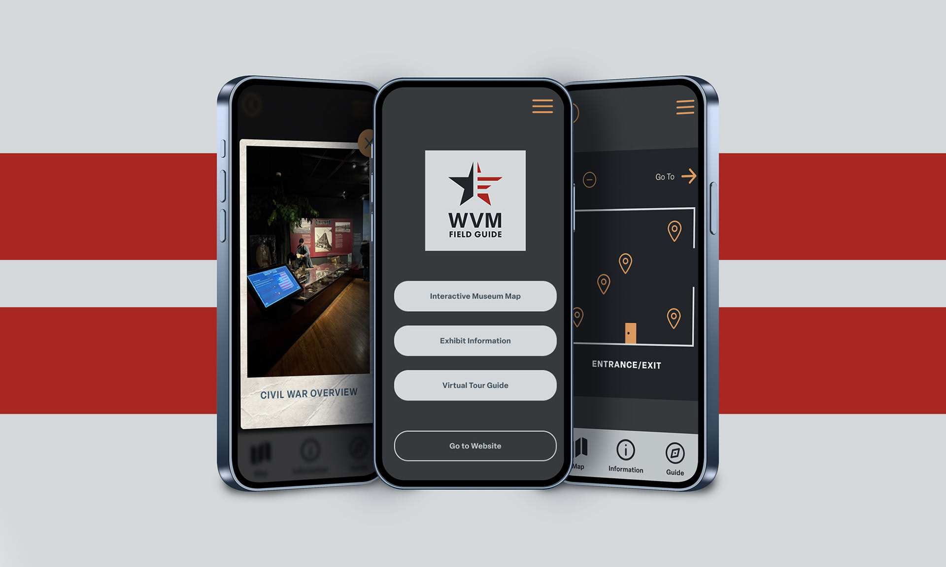
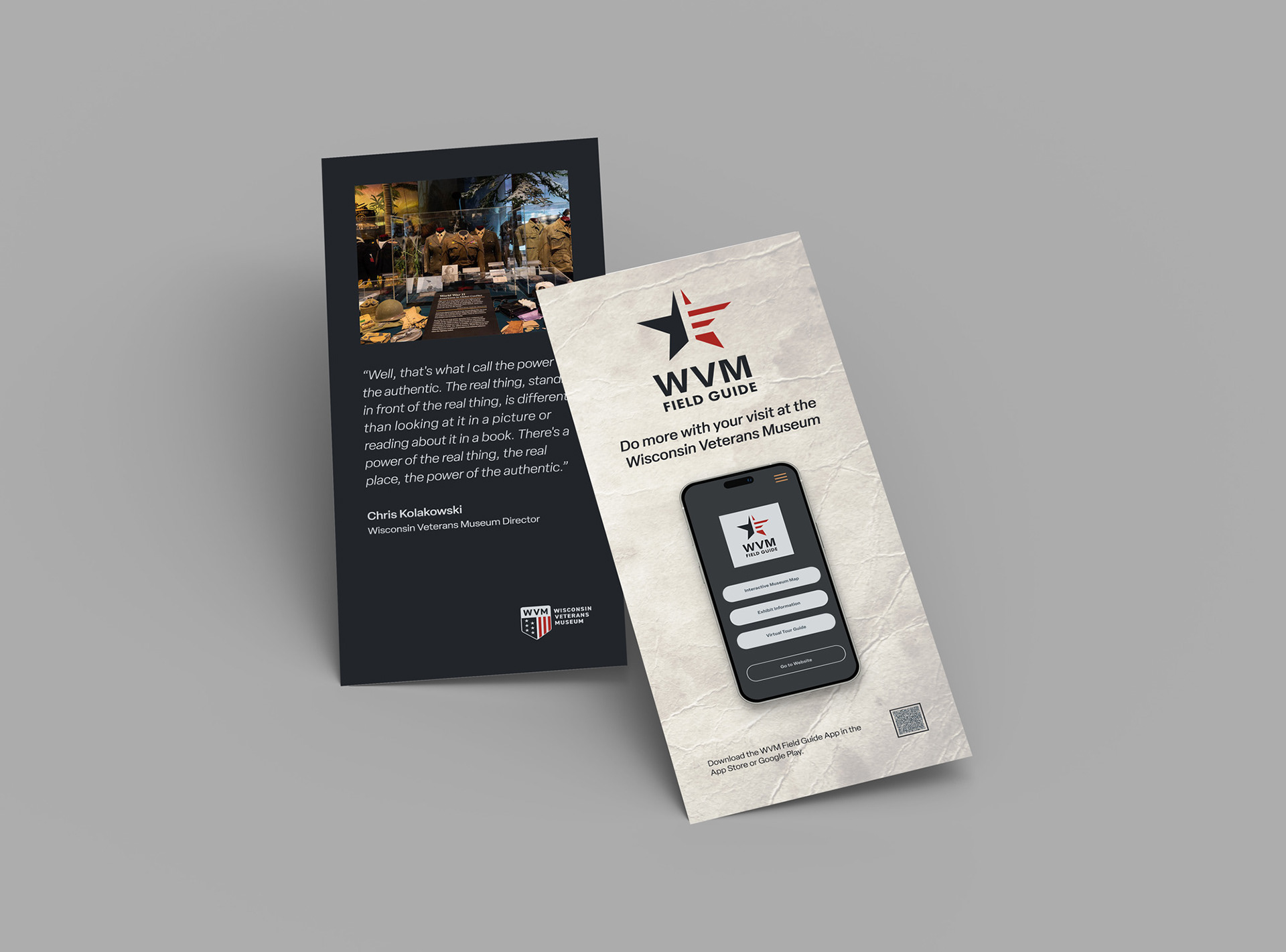
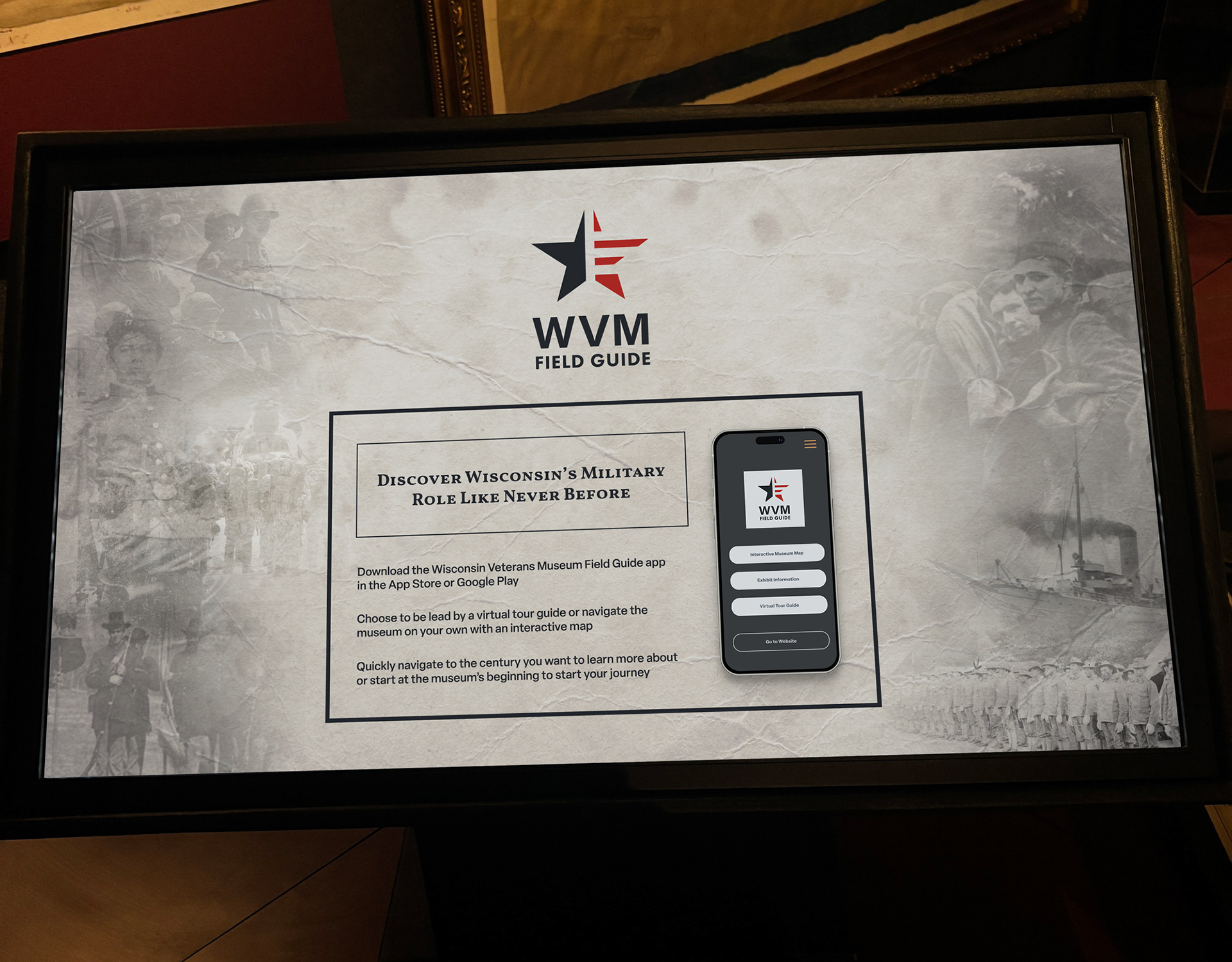
Create a mobile app that takes into account the current Wisconsin Veterans Museum Website while creating a specific museum mode that would allow visitors to navigate the museum through three separate key features: Interactive Museum Map, Exhibit Information, and a Virtual Tour Guide with secondary navigation available.
Skills: Logo Design, UX/UI, Figma, Prototyping
Identity Design Assets

Process
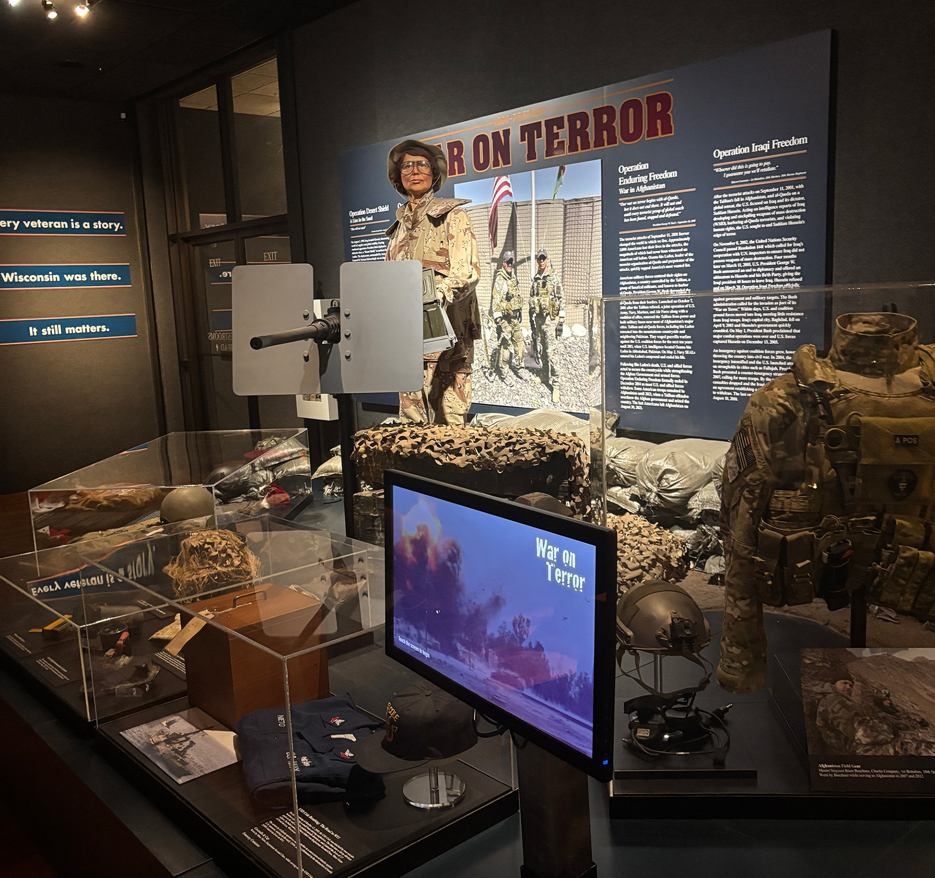
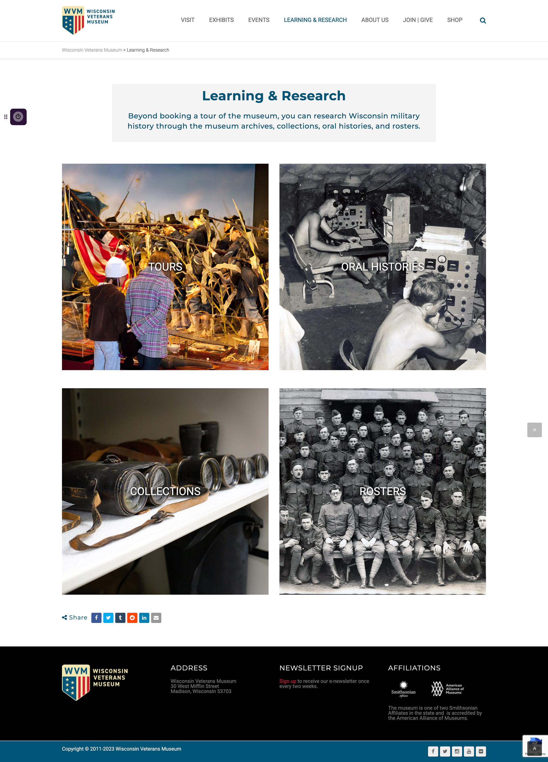
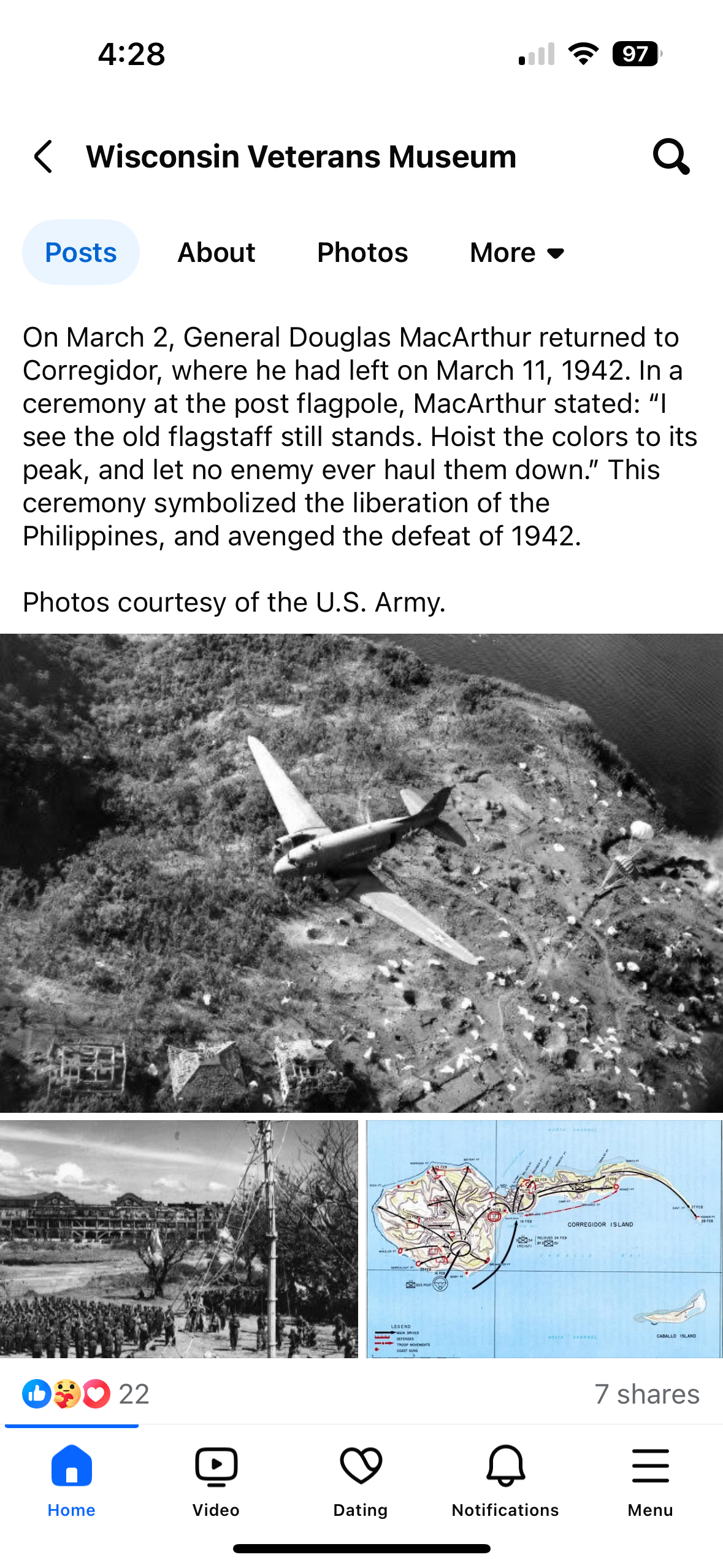
Research the current branding of the Wisconsin Veteran's Museum by studying how they are using color and typographic styles on their website as well as screens, plaques, and banners located within the museum.
Current wisconsin veterans museum Branding

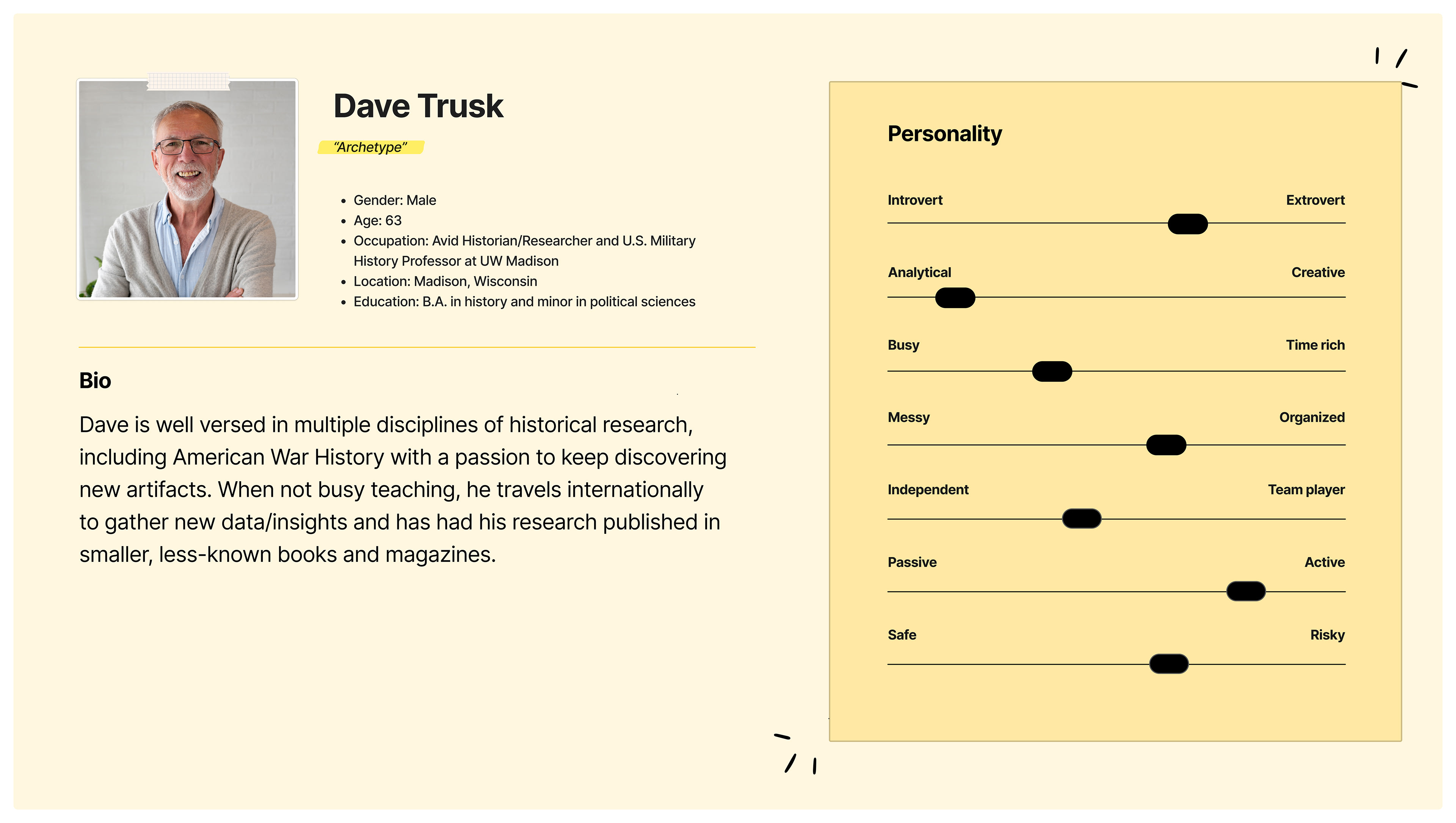
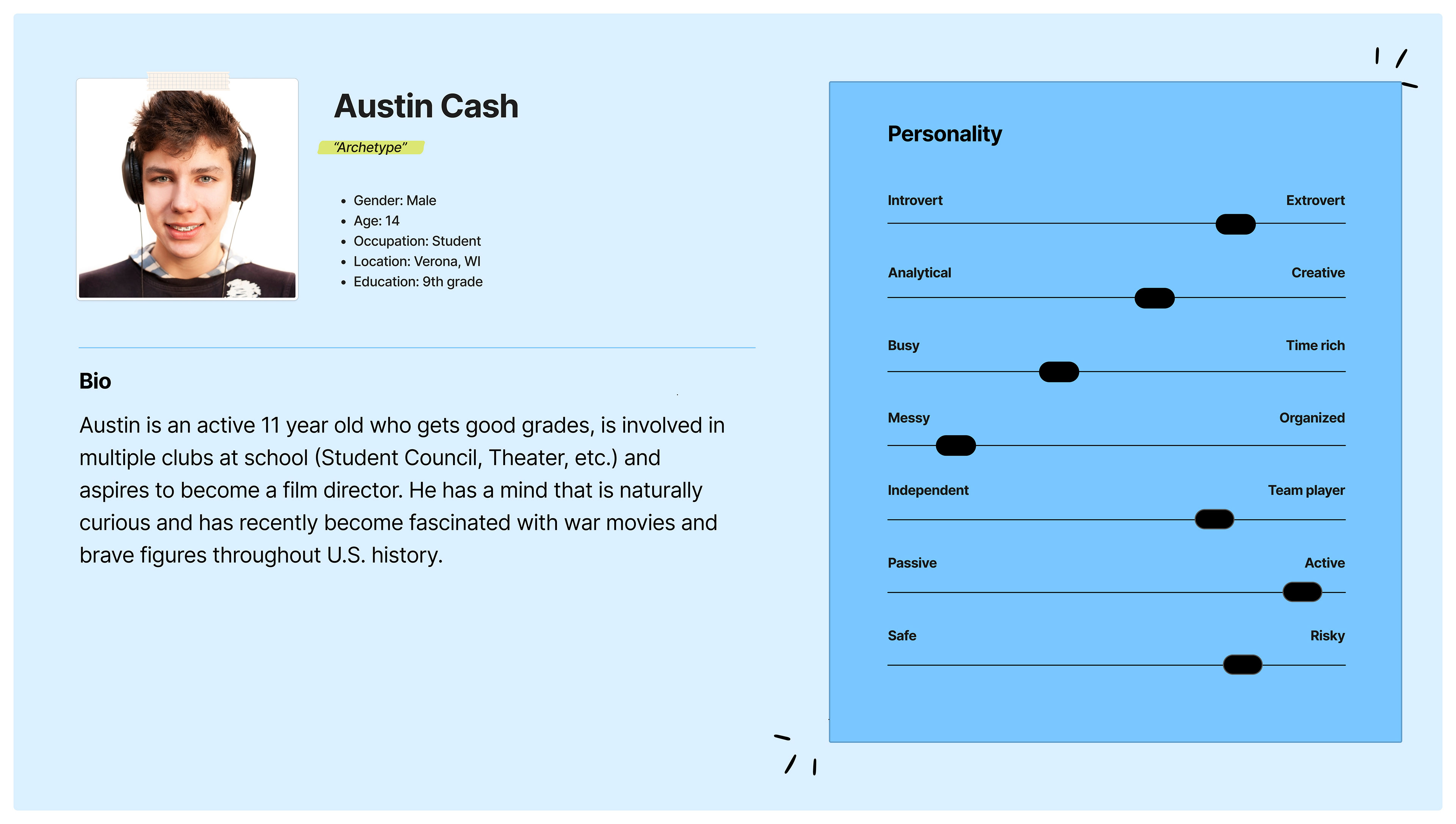
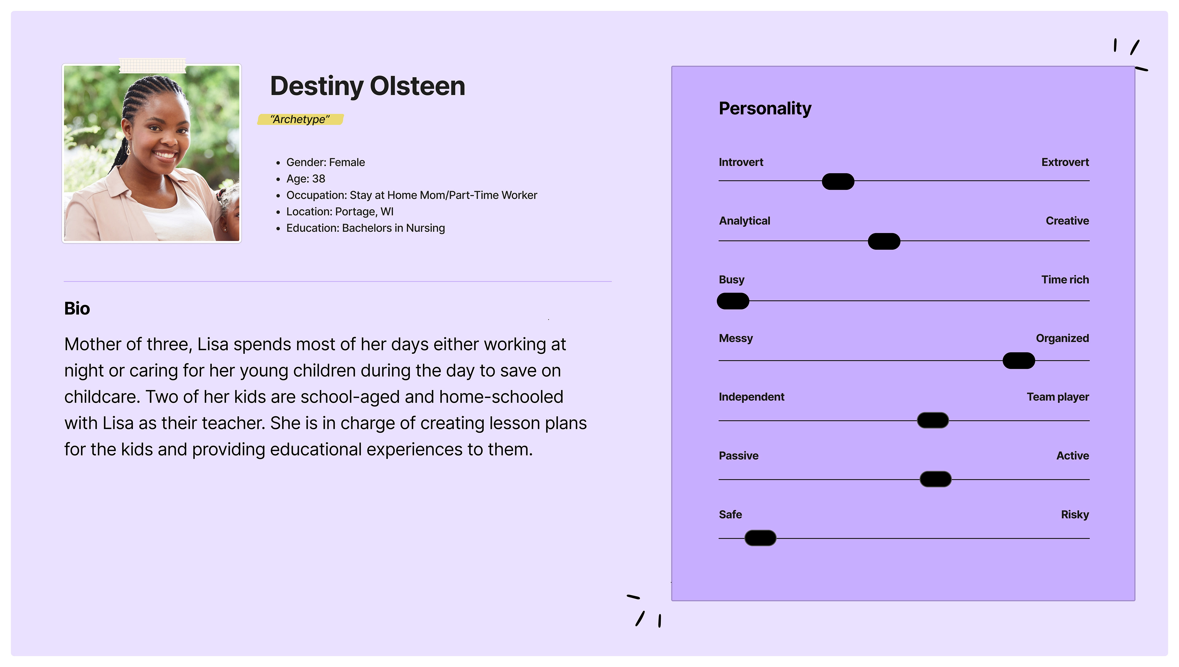
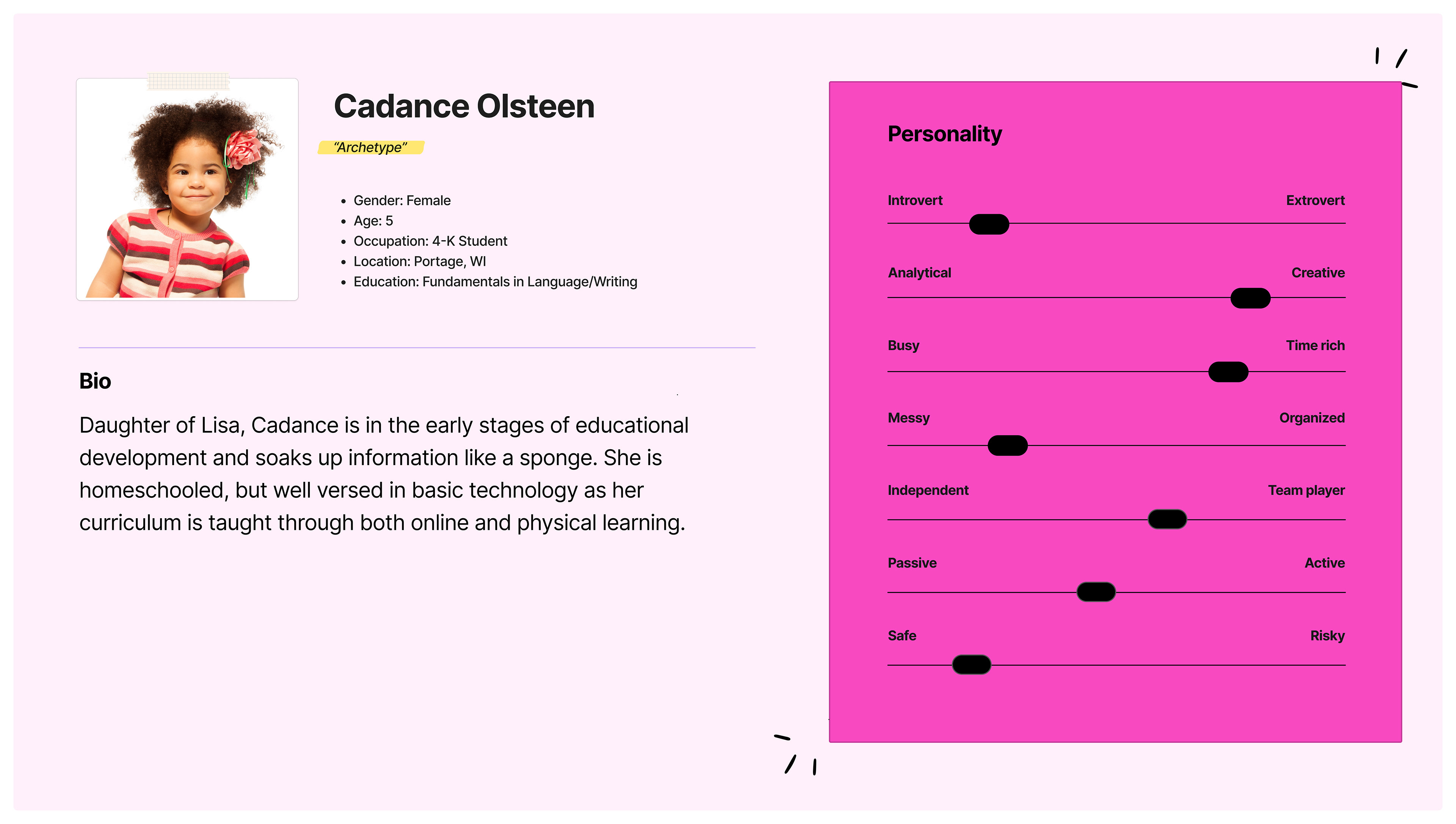
User Personas
Possible users of this app were formulated based off of the educational setting of the museum and how this may look spanning across different age groups. After visiting the museum, all types of age groups were observed, a small child there with his grandmother, pre-teens with guardians, middle-aged married couple, etc.
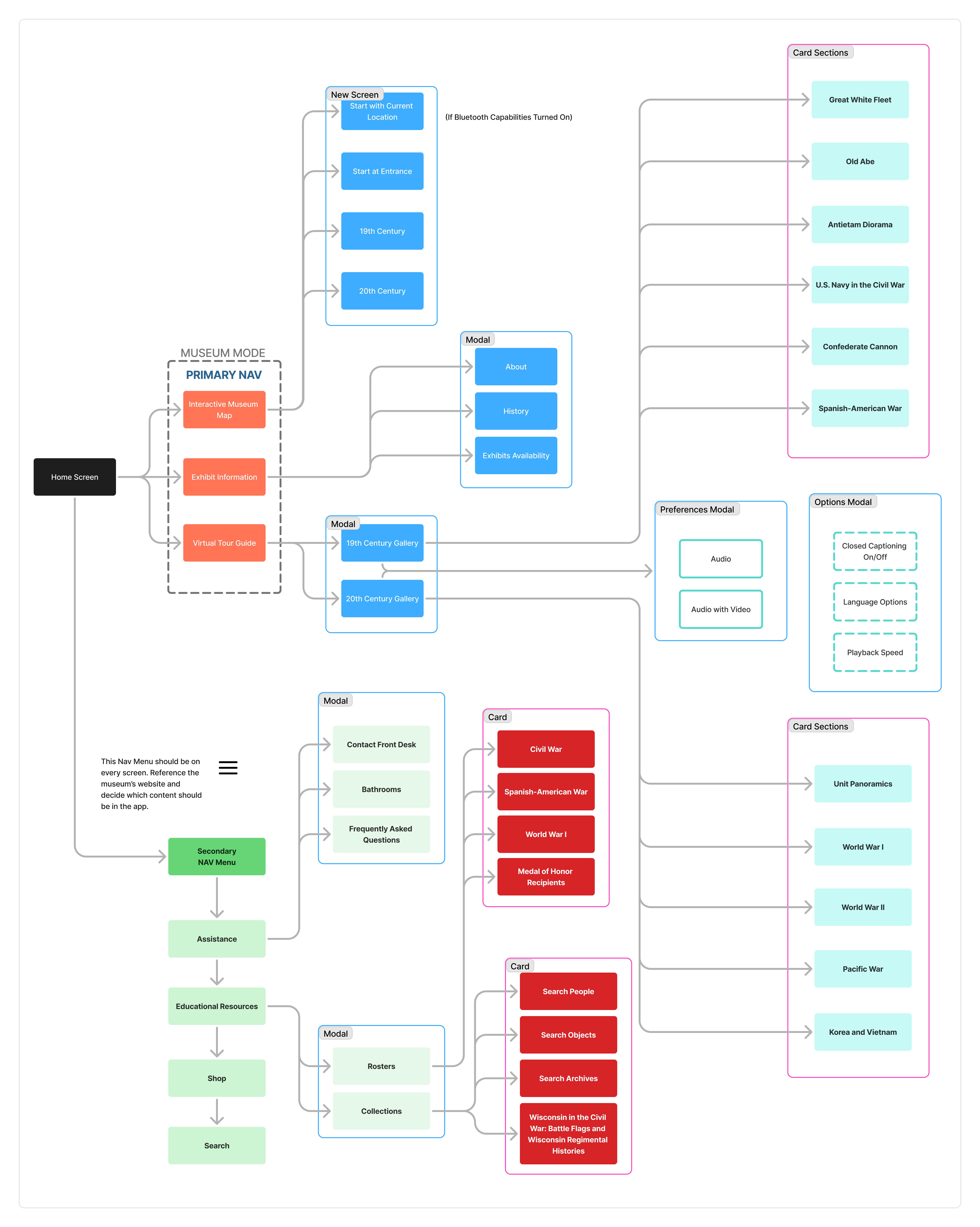
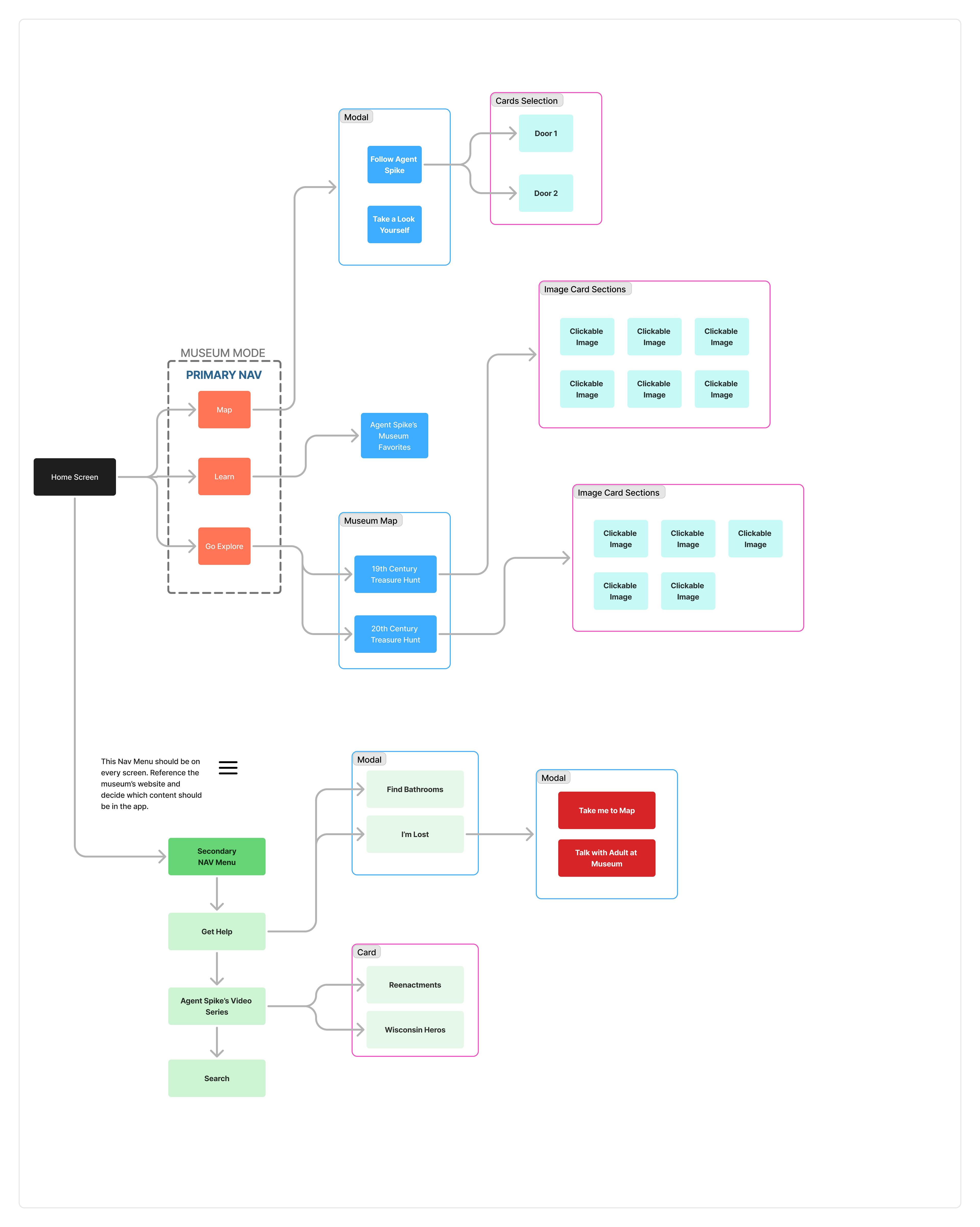
Museum Mode Sitemaps
I began to imagine what it would look like to have two separate modes that catered to an adult’s needs/skillset versus how a child would best learn walking through the museum. These will be referred to as standard mode and kids mode throughout the rest of the case study.
Standard mode sitemap
This mode focuses on readable buttons, modals, and cards that lead you to the content you are in search off with a self initiative approach.
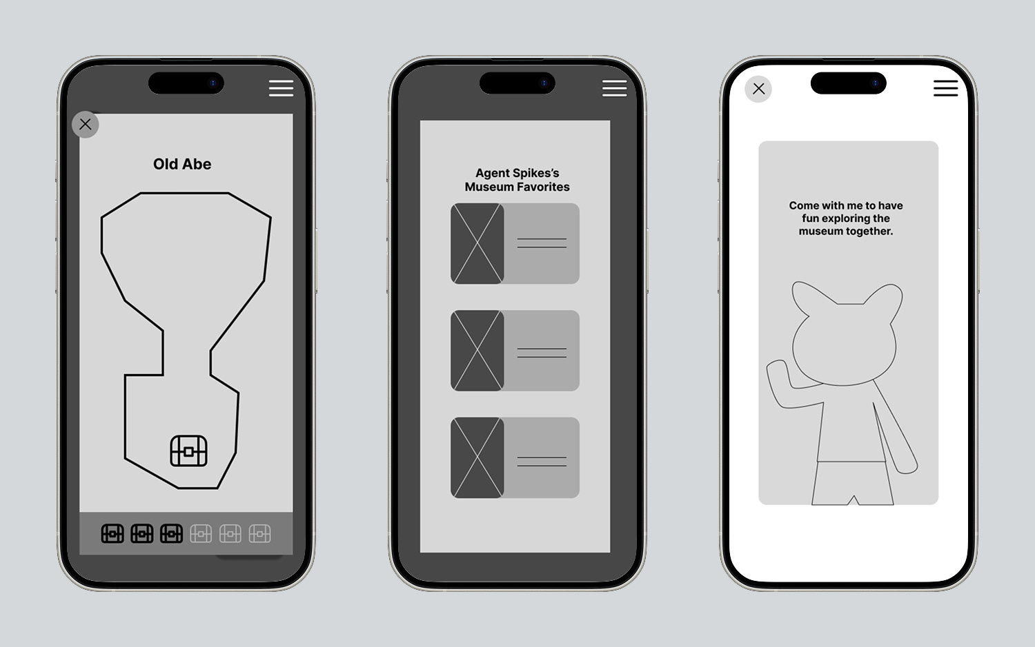
Kid's Mode Sitemap
This mode focuses on audio feedback through a character guiding a child throughout the app using color and shape references while amping up the gamification to keep children engaged.
User Flows
Looking through the sitemaps, I created three user flows based off of what the personas plausible search may consist of. Both the 60 year old historian and war film buff teenager are navigating through the standard mode, while the elementary aged child is going through the kids mode.
Dave - UW Historian Professor and Fanatic

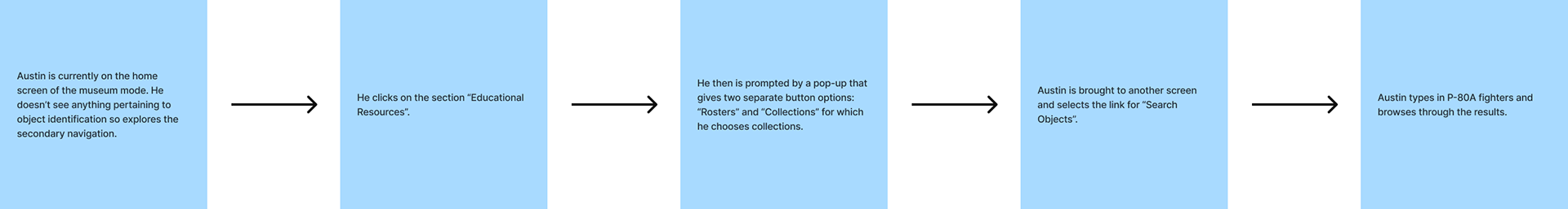
austin - war film buff and aspiring director
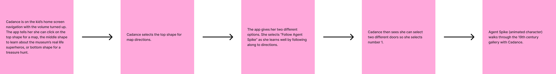
cadance - 4k student
Low Fidelity Wireframes
Main screens were laid out to make sense of how the key features were going to be displayed in both the standard and kids mode in the app. The emphasis was making sure the bones of the app coincided with the user flows and sitemaps.
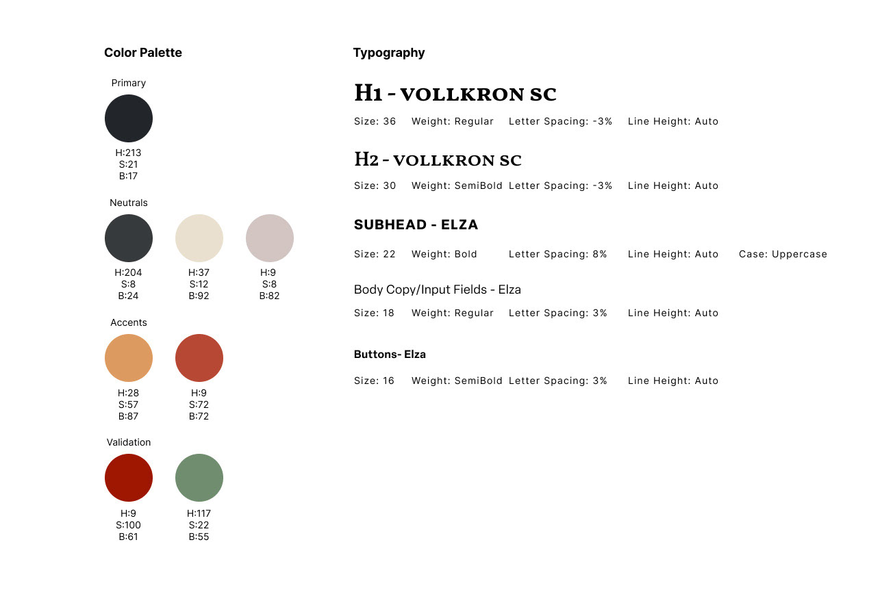
Ui design kit
I wanted to keep the standard app mode backgrounds relatively dark to match the ambience of the museum’s physical setup with strong accent colors that popped off the page to help guide users. I chose a serif for the main section titles to nod to the historical/traditional time periods displayed at the museum and a clean sans serif to create contrast.
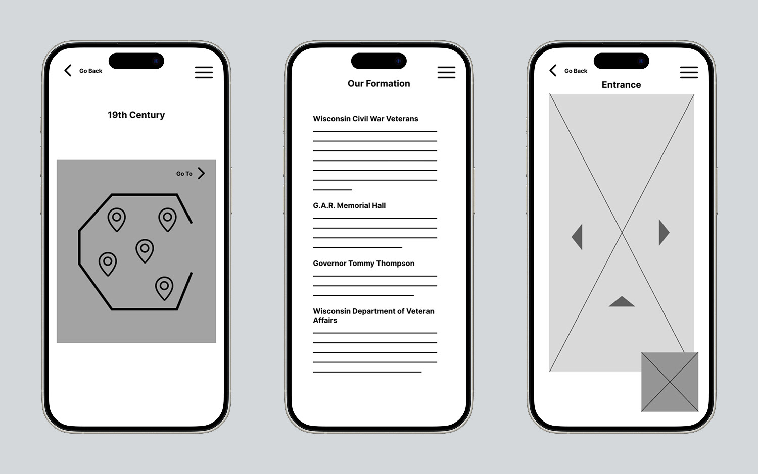
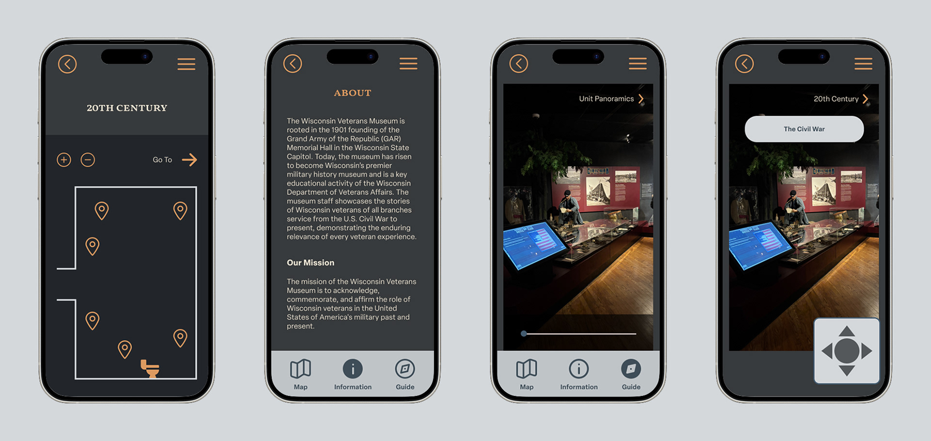
high Fidelity Wireframes for standard mode
All app screens were designed to reflect the UI system with components curated both before and during the screen development stage. Wireframes were added or adjusted after analyzing a step by step process of how you would get from one screen to the next. During this stage, it was important to consider how people learn best, so I instituted two ways to go about virtual navigation (self-directed or watching a video).
Clickable Prototype