Challenge
Kraft Heinz is one of the largest food and beverage companies in the world. With an already established loyal customer base and signature look, what is a new unexpected way to demonstrate KraftHeinz's dedication to their product craft that is typographic based?
Solution
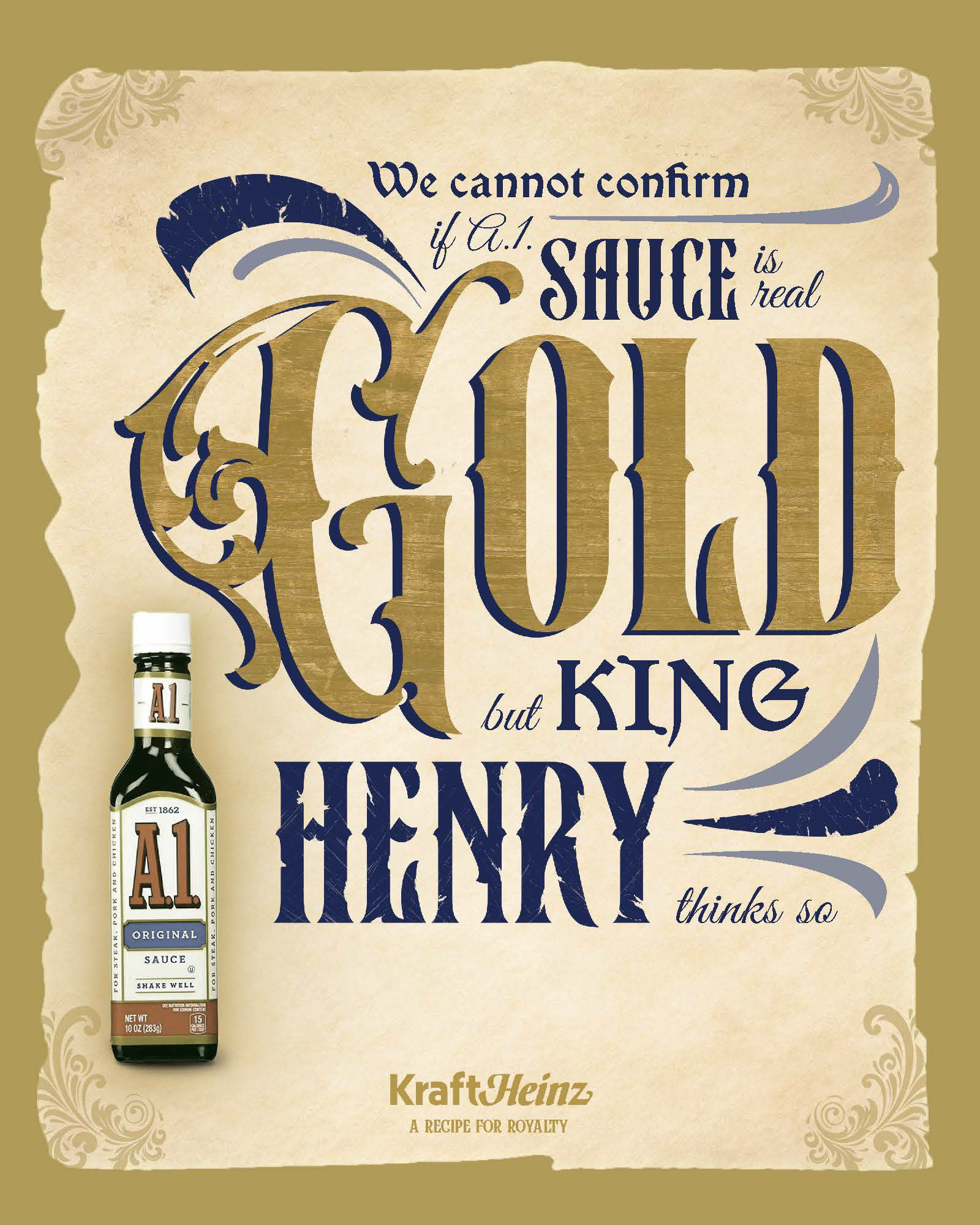
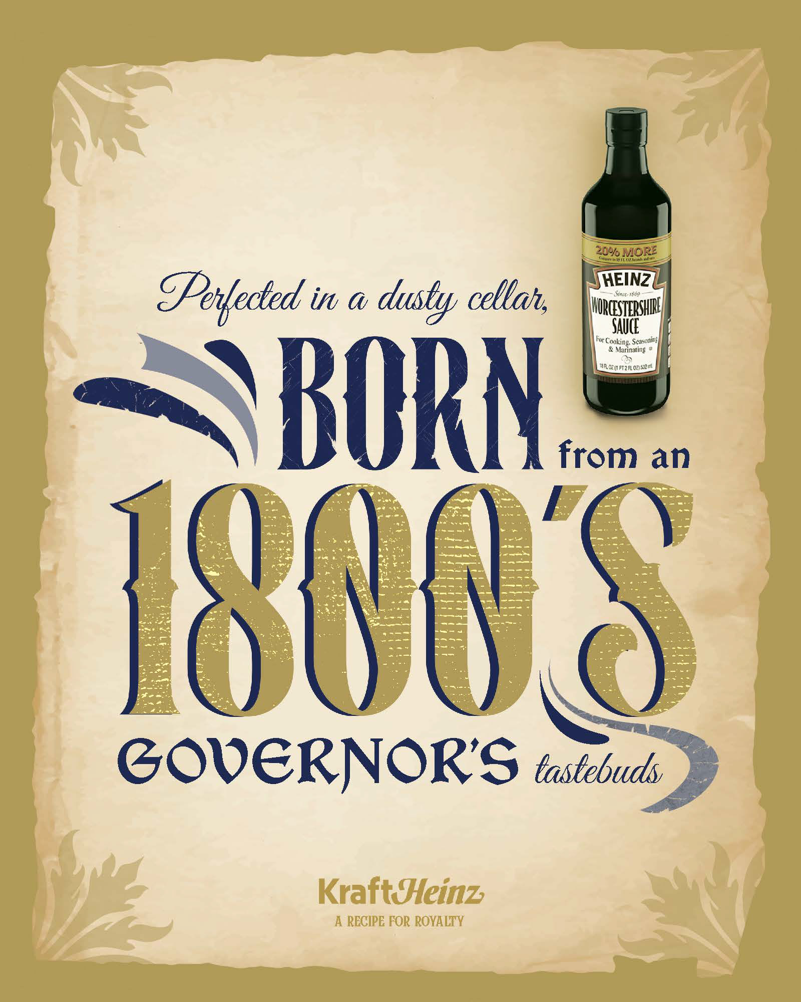
Make a statement about the longevity and history Kraft Heinz products hold through visual elements and typography that felt vintage, leathered, and endured. This was achieved through manipulated textured color swashes that mimicked the highly decorative Duck Brave typeface, torn leather paper framing the type, and ornate border elements. The tagline "Recipe for Royalty" ties together the idea that these condiments have stood the test of time and will continue to do so.
Skills: Adobe Photoshop, Adobe InDesign, Typography, Layout, Copywriting